Chris Moon Creative

Sunday, April 17, 2011

Justification?

I started this blog a few months ago, last August to be precise, because I'd been cast back into the role of fully employed retail display type person through events not completely of my own choosing. I started it as I thought it might aid me in embracing a field that I had, a few years previously left for good, I do tend to maintain that if you're going to do something-do it properly, with vim, vigor and enthusiasm.

However, as of late, all the old ghosts have come back to haunt me. I have thought, and think even more so now, that encouraging folk to buy things they don't really want or need is wrong. Over consumption will be our undoing and I've for a long time disdained marketing and advertising, retail display is merely part of that process and I've run out of ways to justify it otherwise. (My re-entry to retail was as a buyer, and I foolishly thought I could do some good, encourage a bit of enterprise, or something. It was also interesting. ) At some stage I'll take the gap and abandon it, for good this time - well as far as retail goes, anyway. It is, however, the trade I've worked in for over 30 years and will be hard to not utilise skills learned in other projects - one I remember fondly from a year or so ago was for a museum exhibit.

I think, for fun, I'll keep this blog going though and perhaps use it to show the excesses we go to to sell some piece of tat, some piece of glittery gadgetry with its built in obsolescence, some ridiculous fashion statement tacked together to last a season - barely. Perhaps I'll try shine some light on the opposites of that as well.

Goodnight.

Sunday, February 20, 2011

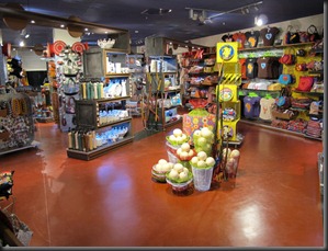
Made in South Africa

I’ve spent the last week slogging it out at my place of permanent employ getting our new venture off the ground and open. The store was finally handed over to us on Tuesday and with a supreme load of effort from all concerned we managed to open for Saturday morning trade.

IMG_0568

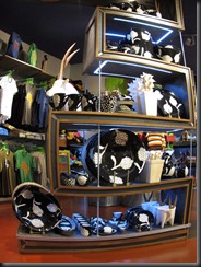
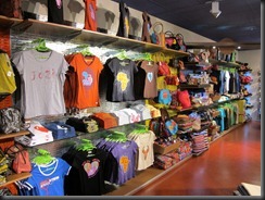
The idea behind ‘Made in South Africa’ is to feature and encourage local talent to go a bit beyond the craft stage in the production of goods.


IMG_0564

The store can be found at the International Departures section of Oliver Tambo Airport on the landside – so locals can shop there as well.


IMG_0558

IMG_0563


Featuring housewares, clothing, costume jewellery and home decor items from all over South Africa.

IMG_0566


IMG_0561IMG_0557

A few more Truworth pics

As promised, last blog, I nipped past Eastgate to get a bigger perspective on Truworth's winter window presentations, there being more window frontage here than at Cresta.
18022011318A better shot of the whole panel than the Cresta pic due to the fact that at Cresta I had the Saturday morning shopping swarm to contend with but at Eastgate it was first thing in the morning.

18022011323Another window, what strikes me is better mannequin placement than I've seen for a while at Truworths.
I also had the opportunity to snap some of Truworth's speciality line windows:

Inwear

18022011317

Those pod people againSmile at

LTD.

18022011321

In fact, the more I look at the mannequin’s expressions, the more I understand Donald Sutherland’s concern…

Daniel Hechter

18022011322

A bit severe, methinks, icy metallic, er, faceless?

Truworth’s Man

18022011324

Oddly enough , I didn’t get what was going on here till I saw the photo, I didn’t see the optical illusion thing with my own two eyes.

At least the speedbumps have gone…

Wednesday, February 16, 2011

Into the new season

February and already the plane trees are turning, an ominous sign as I tootle through to the airport on the Enfield.

We've seen the back of the Sales and the back of frikking Valentines Day so onwards and upwards..

At Cresta this last weekend I saw the first signs of the new season...Firstly, that chain I love to poke holes in ( but only 'cos they try and in trying make such glaring WTFs)..


Truworths


And would you believe it, I like it. Not in yer face, but subtle, seasonal colours and textures, nicely (in my mind) transforming the window from a blank shoebox shape into something with corners and depth. A city scape feel with clever lighting tricks, I'll nip into Eastgate this week to check those windows out (bigger, more room to play.)

Also Truworth's LTD window thus:


What are those???

Lets take a closer look...


Omigod..alien pods!!


Sorry, I meant:


A quick glance at the window shows no sign of facehugger activity from the open pod, though the mannequin at the right looks a bit apprehensive...

No, yes, I realise they are flower pods and I think that they're actually quite good - I have an overactive imagination - and look at that lighting effect (sorry I likes a good lighting effect)..

Moving on... Foschinni's at Cresta


I like it, initially, but I wonder if it's somehow the finished thing I'm looking at. Further delving is required, there's almost too much prop.


Er, is that canvas supposed to be back to front? Can't help liking it though, it hints at things - like a work in progress -stay tuned...


Valentines Day

*Shudder*

Nope,I shall not post any pictures here about this overblown, guts ripped out of it, money grubbing charade this particular promotional activity has descended into.

For a comprehensive review/crit of participants I recommend Ingrid's page.

For a once pagan holiday based around wolves and hunting and stuff, bleugh. The constant "If you 'love' someone spend oodles and oodles on a pile of utter kitsch" really gets my anti-retail muscle twitching...

Phegh! Here I love ya, please accept this rather horrendously designed twist of otherwise useless precious metals and stones that have probably cost a few lives (and shortened many others),not to mention caused untold havoc to the environment .. sorry, I worked on a gold mine once - I've seen what goes down..

Anyway, next blog, something a bit more positive.

Peace and luuuuuuuuuuuuuuuuuuuuuuurve....


Sunday, January 16, 2011

Sale Time

Post xmas sale season is upon us and we are, as usual, inundated with broken size-curves, duff merchandise and unwanted lines. Which is the time I do my shopping as I can pick up something at a steal that I like that the masses didn't , my win >:-)

Sale presentations have always been an pain-in-the-posterier in my time in retail. From the pack-the-window-with-as-much-crap-as-possible-so-no-one-misses-it mindset (well to be honest I've found that criteria applied in non-sale presentations as well, sooooo) to the still persistent idea that it should be presented as 'fashionably' and prominently as possible to entice sales - er, its on sale because, well it didn't sell, and folk don't like it and mutton dressed as lamb is still mutton!

Still, the sale has to be distinguishable from other promotional activity. Again, like Xmas, sale-time tends to rather design restrictive, the norm being 'SALE' in big letters and a combination of red, white and black or black, red and white or...you get the picture.

Yes, in my mind sale is sale, you're taking a knock on your prices and the last thing you want to do is throw more money at it. But it is still a representation of who you are and hopefully, an enticement to the customer to buy into new lines and regular non-sale items and I think, in todays retail market image is near everything - a shabby sale makes you look shabby and cheap merchandising is just that.

I like the clean lean and mean option, let folk now what's going on in an as expedient way as possible - like this:


By now your customer should have an idea of the kind of merchandise that you have and what to expect.If your image looks professional and crisp then the expectation that a good bargain is to be had will be maintained.

Nothing wrong with a bit of fun, a quirk, something that stands out from the herd and it doesn't have to cost an arm and a leg.

I liked Truworths take:


Yah, I couldn't resist, (Truworth bashing again?) It was first thing in the morning and the signage had fallen down overnight, revealing a rather bemused looking mannequin to the early morning mallers seeking that pre working/shopping day caffeinated rush. I do like the idea of the model clad in sale-wrap - effective, to the point and with a touch of humour.


Sale Time

Post xmas sale season is upon us and we are, as usual, inundated with broken size-curves, duff merchandise and unwanted lines. Which is the time I do my shopping as I can pick up something at a steal that I like that the masses didn't , my win >:-)

Sale presentations have always been an pain-in-the-posterier in my time in retail. From the pack-the-window-with-as-much-crap-as-possible-so-no-one-misses-it mindset (well to be honest I've found that criteria applied in non-sale presentations as well, sooooo) to the still persistent idea that it should be presented as 'fashionably' and prominently as possible to entice sales - er, its on sale because, well it didn't sell, and folk don't like it and mutton dressed as lamb is still mutton!

Still, the sale has to be distinguishable from other promotional activity. Again, like Xmas, sale-time tends to rather design restrictive, the norm being 'SALE' in big letters and a combination of red, white and black or black, red and white or...you get the picture.

Yes, in my mind sale is sale, you're taking a knock on your prices and the last thing you want to do is throw more money at it. But it is still a representation of who you are and hopefully, an enticement to the customer to buy into new lines and regular non-sale items and I think, in todays retail market image is near everything - a shabby sale makes you look shabby and cheap merchandising is just that.

I like the clean lean and mean option, let folk now what's going on in an as expedient way as possible - like this:


By now your customer should have an idea of the kind of merchandise that you have and what to expect.If your image looks professional and crisp then the expectation that a good bargain is to be had will be maintained.

Nothing wrong with a bit of fun, a quirk, something that stands out from the herd and it doesn't have to cost an arm and a leg.

I liked Truworths take:


Yah, I couldn't resist, (Truworth bashing again?) It was first thing in the morning and the signage had fallen down overnight, revealing a rather bemused looking mannequin to the early morning mallers seeking that pre working/shopping day caffeinated rush. I do like the idea of the model clad in sale-wrap - effective, to the point and with a touch of humour.