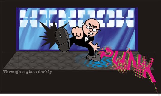
I did find another Truworths window - their Man's shop, and I think this one shows another way that they've lost the track at the moment.I think you can get so absorbed by creating new and exciting props that you lose sight of what the props actually represent and start distracting from the window. What are these? Hubcaps - little ones..and everyone's now bald- help!!

Here's quite a campaign at Cape Union Mart an 'outdoorswear' retailer, all around rucksacks and all very informative, actually, different rucksacks for different lifestyles ranging from the city hiker to the woodsman and everything inbetween. I'll bet those cardboard pop-outs set them back a bit!

Here's another outdoorswear chain - Due South jumping on the ,er, green bandwagon with 'Earth' inspired t-shirts.....I, myself, don't like the shotgun scattering of visuals all over the place here, big picture-at-the-back.....no focal point as such and a little hard to discern what the actual t-shirts are.

Independents can vary from the really, really good to the dreadful. many, unfortunately, have the sales staff doing the actual window displays with the thinking that if they know haw to sell it, they'll know how to display it....I think it depends on what you are trying to tell. If it's a straight fashion story co-ordinated and dressed on good mannequins/props in a small area then you can get a way with it. The one here, A little chain called Nicci - (they have a few shops in a couple of malls) have always managed to put in a neat concise statement, even if its not mainstream fashion. Perhaps style statement would be a better description, nicely offset with the chandelier.

I completely forgot to get this outlets name, I haven't seen them before, they are a sportswear outlet. I'm totally bored with endless rows of headless torsos, I know that the cost of mannequins is exorbitantly high, but still, there are other ways of displaying clothing other than on a torso. The flaccid limp arms tucked into pockets, the sort of step-and-repeat positioning that really gets tiresome used time after time. In limited instances, they are fine (see Nicci above) but in this instance I feel its just too much. And my other beef - lighting!! I think lighting is make-or-break on a window and to skimp on this detail in the shop window (or interior) construction is criminal.

However, I did like the decal treatment on the glass and the small step and repeat treatment of rugby tops in another small window - which was repeated on an ajoining wall instore.
