Chris Moon Creative

Sunday, October 17, 2010

The good, the bad, the ugly..

Cue relevant theme music......

Had to pop down to Cresta Centre yesterday - crikey, twice in a month, this is getting a bad habit, but 'onest guv' I needed a new 'puter screen and I thought, on the off chance, I might find a copy of the new Grinderman album (ha, ha, fat chance!).

So, out wi' the handy cell-camera for a few window piccies to maul on line.I'm using the cellie camera more and more, I get irate looks and was chased out of Eastgate a couple of weeks ago for daring to brandish my usual camera (though that might've been merely due to an overly authoritative security guard wanting to make a point).

I'm collaborating with a few other window-dressery types online to do a worst of best of thing, Ingrid Summers being one of the co-conspirators....

So without further ado, Here's Foschinni, well placed in the mall nice, neat, nothing overtly ooohhhmygawrsh, but typically (for Foschinni) well balanced/lit/etc etc. Put it in the 'good' catagory...


Identity, a young fashion chain, linked to Truworths I think. Fun window, catchy theme but let down by not really connecting to the merchandise, in fact almost overpowering the stock - too much prop, methinks.


Now, this I call bad. Neatly dressed, well lit, prime bloody position in the mall, but come on?!?! Where's the effort, would a leeeetle propping go astray? It's obviously a matric dress window. No idea on mannequin placement in relation to mannequin or window frame... The cost of the garments alone tells me that couldn't a leeetle budget be found to get decent windows in?


Miladies at the mo' must be one of the most boring clothing chains around, apart from that other one ermmmm, dammit, the name slips my mind at present. Look at this...be still my heart. Up, up and errrr, take it away....The accessories window leaves me equally cold...I think it has to do with my aversion to mirror-chrome, next thing it'll be all burnt orange and shag-pile - watch.


These guys need their posteriors well kicked, very good position, within the 'entertainment' section at Cresta, across from a Barnyard venue and right next to a Spur. The stock available alone could create a window of awesomeness. Surfwear/t-shirts/skateboards. What do we get:
"In Your Wildest Jeans"?????? oh dear, Billabong, I think somewhere along the line there's been too much sun and toke too many.


Then I went blind... or perhaps the hangover was kicking in...I actually forget the name of the place, I was in shock, City Girl or City Nights or some such- big, neon, red. 
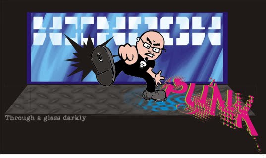
There should be some kind of law in malls about this kind of thing, there are no words to describe the horror, perhaps they are trying to be cynically hip in some way...Take it awaaaaaaaaaaaaaayyy....

Saturday, October 9, 2010

Cresta

So, hot on the heels of this morning's post I find myself with time on hand so I nip down to the Cresta mall in Blackheath. Cresta is often seen as the poor mans Sandton City, its certainly, in my eyes, more 'popular' as far as headcounts go (in fact I seldom go there , too damn crowded! Oh, and btw , I loathe malls......)


I initially wanted to check out the Edgars revamp, very smart it is, typically 'Edgars' with a far more open feel than previous incarnations with a good line of sight to the far reaches of both floors with lots of name logos and graphics to pull you through. I still feel though, if you were blindfolded and led unknowingly to the middle of an Edgars store that you wouldn't really know where you were when the blindfold was removed.


My biggest surprise, however, was the Jet revamp.I was aware of a revamp at the Eastgate mall but had no idea what it entailed. If you thought that deconstructivism was past its sell by date no-one told Jet. Ceilings out, guts revealed and everything painted mat black, which complmented the merchandise very well. There was some ceiling detail picked out in an industrial yellow. One would think with all the black that the lighting levels would suffer, surprisingly not, the floorstock standing out very well with no pervasive sense of shadowy gloom often found with blacked out ceilings.


Another surprise - the've put back dedicated window space - with mannequins!
Its not that they're wonderful windows, I was just somewhat struck that after so many years of poster advetorials with some badly placed stock squeezed somewhere in there that Jet had forgotten visual merchandising completely.

Friday, October 8, 2010

Jerry

How time flies!! A month fraut with store relays (and re relays), running around sourcing props and a weeks leave levered in at the end to unwind a bit, but also do the million and one things that needed to be done around the house.

Anyway, Jerry.....? Jerry was a trainee I had way back in Jet Eloff Street, when Jet still did windows and not those bland 'big-poster-ad-and-an-unnesesary-pile of-merchandise-next-to-it' things they do these days. Jerry was keen, worked hard/played hard as I suppose we all did. The only thing I battled to get him to do right was merchandise selection. Though main windows featured advertised lines as close to the pictured items as possible there were always inbetween times to take care of. Also at that store, we had more than enough window space to go beyond the advertised lines. Jerry seemed to battle co-ordinating colour,ending up with mismatched clothing across the window front.When this happened on preplanned advertised stock I began to realise that Jerry was perhaps colourblind. It just meant that one of us would check the merchandise before it was steamed and prepped.


The point of this reflection on past days is I think I know what's happened to Truworths windows over the last few years....Jerry's working there!! I must admit that I have been out of mainstream visual merchanding in any capacity but as an observer for a while now, but I have always thought that colour co-ordination was one of the main tenets of a good presentation - did that change?


Also, for fun I thought I'd snap some windows away from the big sparkly malls. The headless Truworths model presentation above was from the shopping centre in Brixton, the other two from a large mall in Kempton Park - better models but still not a patch on what you'd find in, say, Sandton or Canal Walk.


However, from upper class to middle of the road and down, all the windows were clinically tidy, well lit and similarly propped.
Also snapped, a new theme from Truworths - shipping/camoflague? (all a bit close to the present political climate methinks ;-p)


Whilst in Kempton Park I noticed the Edgars mens theme, I suppose unuaual in that many Edgars stores I see these days have little or no window space (reminds self-must get down to see Edgars revamped Cresta store) -but a pretty bland presentation anyway. (Aside,Edgars was one of the stores I used to regularly check for innovation and high standards - used to...)


One from Foschinni - subtle use of the red used to emphasis the cancer awareness campaign, though perhaps the round cancer sign could've been better positioned. I find the window nice, tight and crisp.